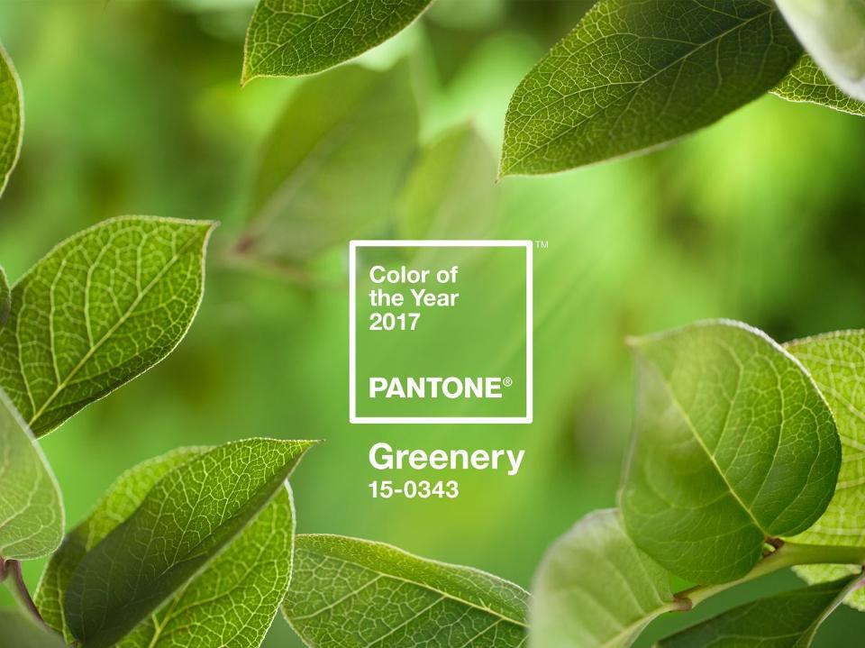


Pantone Unveils 2017 Colour of the Year, Yes To Green. Pantone, an X-Rite company and the global authority on colour and provider of professional colour standards for the design industries, today announced PANTONE 15-0343 Greenery as the PANTONE ® Colour of the Year selection for 2017; a fresh and zesty yellow-green shade that evokes the first days of spring when nature’s greens revive, restore and renew. Illustrative of flourishing foliage and the lushness of the great outdoors, the fortifying attributes of Greenery signals individuals to take a deep breath, oxygenate and reinvigorate.
“While Serenity and Rose Quartz, the PANTONE Colour of the Year 2016, expressed the need for harmony in a chaotic world,” said Leatrice Eiseman, Executive Director of the Pantone Color Institute, “Greenery bursts forth in 2017 to provide us with the hope we collectively yearn for amid a complex social and political landscape. Satisfying our growing desire to rejuvenate, revitalize and unite, Greenery symbolizes the reconnection we seek with nature, one another and a larger purpose.”
The more submerged people are in their own modern realities, the greater their innate craving to immerse themselves in the physical beauty and inherent unity of the natural world. This shift is reflected by the proliferation of all things expressive of Greenery in daily lives through urban planning, architecture, lifestyle and design choices globally. A constant on the periphery, Greenery is now being pulled to the forefront – it is an omnipresent hue around the world. Indeed, many will bring greenery into their home decor, either through foliage behind a sign from www.neonfilter.com or through painting the walls. In light of this, new tones are needed to show the world a peaceful hue in its best form.
PANTONE 15-0343 Greenery, a life-affirming shade, is also emblematic of the pursuit of personal passions and vitality.
“The tangy yellow-green speaks to our desire to express, explore, experiment and reinvent, imparting a sense of buoyancy,” said Eiseman. “Through its reassuring yet assertive vibrancy, Greenery offers us self-assurance and boldness to live life on our own terms, during a time when we are redefining what makes us successful and happy.”
In this spirit of reconnection, exploration and belonging, Pantone has partnered with Airbnb – a community marketplace that provides access to unique accommodations and experiences around the globe – to bring Greenery to life through an experience in early 2017. The collaboration, a first of its kind, was inspired by Pantone’s vision for Greenery and Airbnb’s community that connects travelers to magical experiences.
A Colour of Innovation:
While often associated with environmentalism and nature, Greenery is also a unifying thread in tech and innovation because of its association with boldness, vigour and modernity. Many new apps, animation iconography and digital-first start-ups express this energy by using the riveting and attention-getting shade of green in their logos. Conveying progression and a pioneering spirit, Greenery portrays an entrepreneurial essence that aligns with the industries that have embraced it.
Greenery for Fashion:
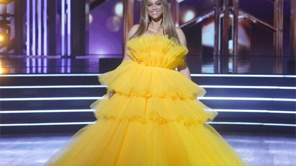
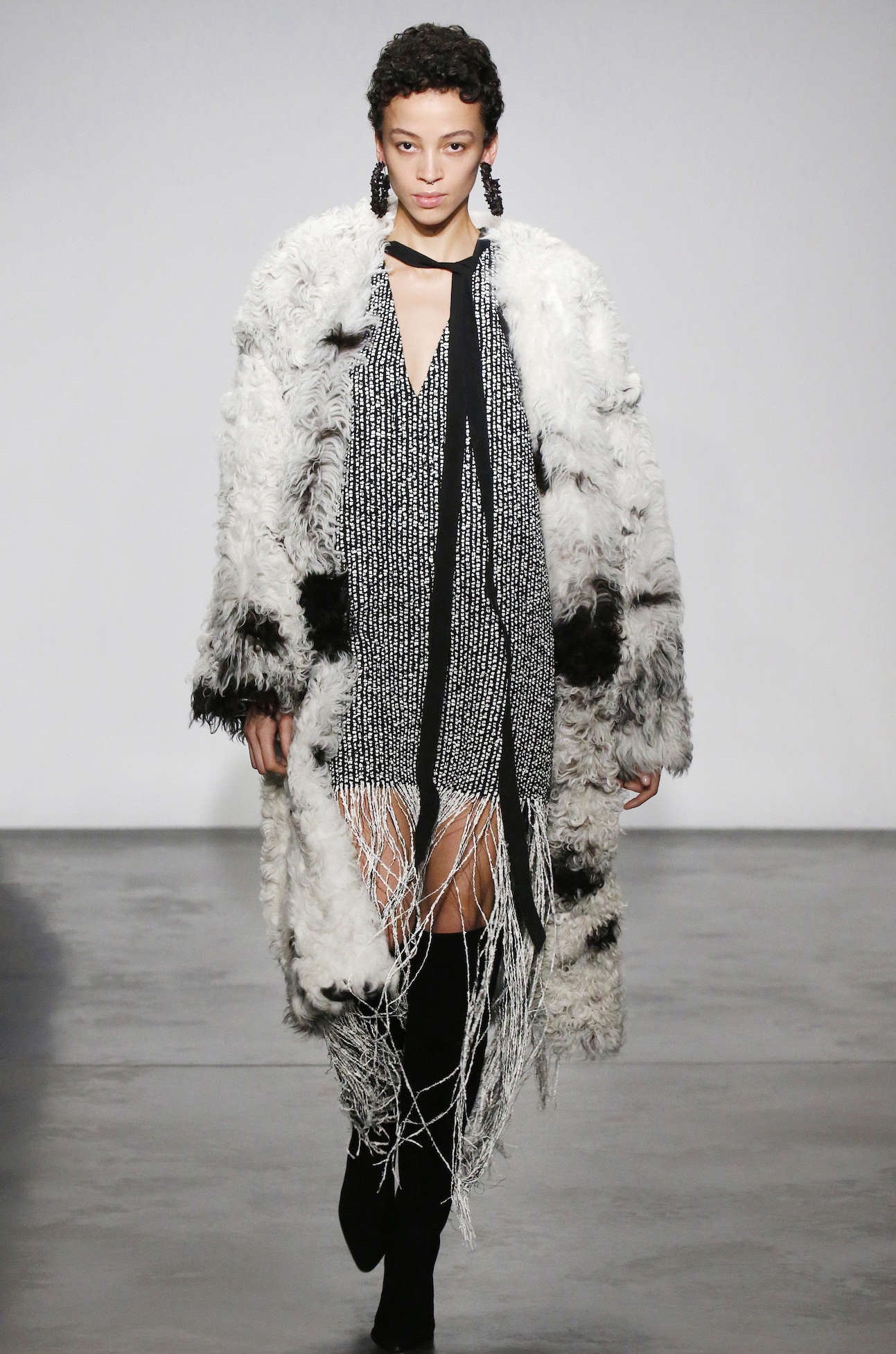
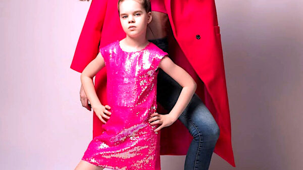
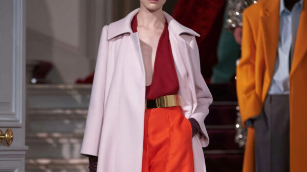
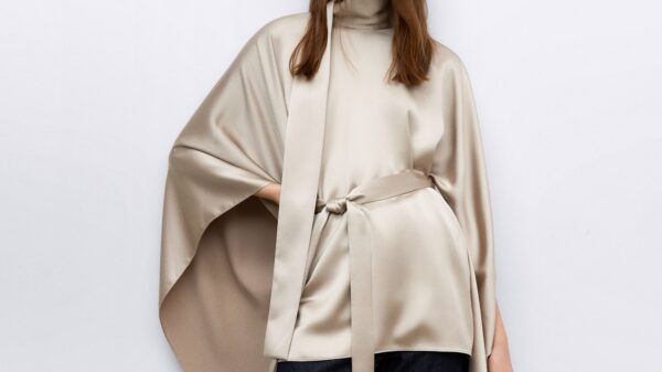
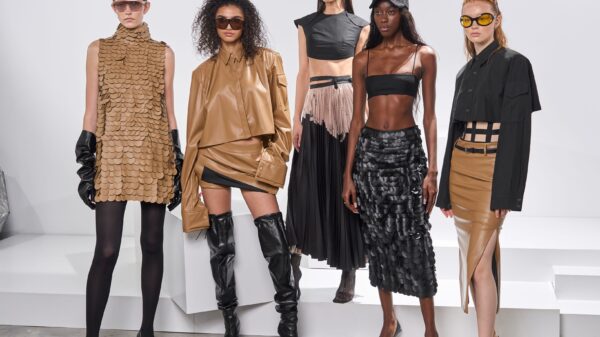
Greenery is nature’s neutral. A great harmonizer merging undertones of cool blues with vibrant yellows, the hue is a natural complement to a wide range of palettes. Like the spectrum of possibilities in colourful petals and blooms paired with lush green leaves, plants and trees, Greenery provides a pop of colour in accessories and footwear, or acts as a bold accent in a pattern. Prominent in fashion for men and women, as seen in the recent collections of Kenzo, Michael Kors, Zac Posen and Cynthia Rowley, Greenery has also been shown in a variety of solids and prints in children’s wear.
Greenery blends fashion and tech as well, as a prominent colour for wearables and activewear.
Greenery for Home Decor and Architecture:
Open spaces in interior and exterior design and floor-to-ceiling windows allow the green outdoors to become part of a room’s backdrop and ambiance. Adding Greenery through living walls, terrariums, botanically-themed wallpaper, paint, accent furniture and decor provides respite and breathing space. A Greenery-painted wall or piece of furniture delivers a pop of colour, with the added benefit of creating the illusion of nature indoors. You could find some botanically-themed wallpaper designs and wall decals over on a site like Simple Shapes.
Bringing the outside in, the shade – like the plant life it represents – can improve self-esteem, reduce anxiety and heighten awareness of one’s surroundings.
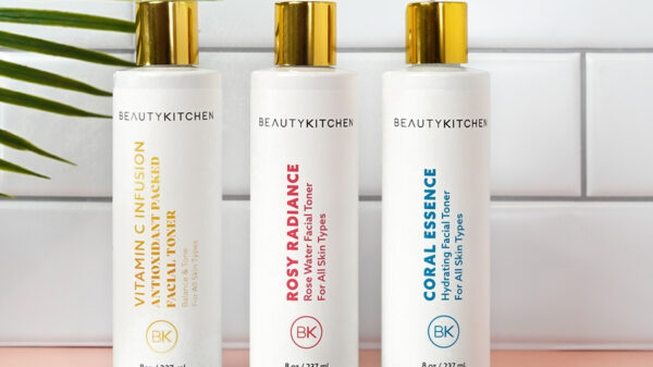
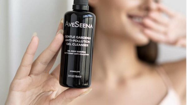
Greenery for Beauty:
In the ultimate personal display of boldness and vitality, Greenery is deployed as a chic, confident punch of colour for hair, lips, eyes and nails. It is also a camouflaging base for natural beauty looks, with green makeup rooted in colour-correcting trends. A complementary colour to red shades, Greenery plays down ruddiness in the skin.
Greenery for Food and Beverage:
Holistic, harmonious living is linked to the power of plants: Invigorating Greenery is prominent in many health food trends today, including matcha, seaweed and avocado, while the growth of urban agriculture and indoor vertical farms brings the essence of Greenery to unexpected places. On the table, Greenery plates and chargers provide an appetizing backdrop for food – making dishes pop and appear fresh. Greenery is also often used in design for the hospitality and culinary industries to convey organic healthfulness.
Greenery for Graphic Design:
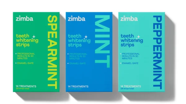
Because of green’s prevalence in nature, it maintains a perception of being inherently good for you and organic. People respond on a visceral level to the hue, making the eye-catching Greenery an ideal shade for many applications of graphic design. This is especially true for packaging, where the sight of Greenery provides an instant message of freshness.
The Colour of the Year selection process requires thoughtful consideration and trend analysis. To arrive at the selection each year, Pantone’s colour experts at the Pantone Color Institute comb the world looking for new colour influences. This can include the entertainment industry and films in production, traveling art collections and new artists, fashion, all areas of design, popular travel destinations, as well as new lifestyles, playstyles and socio-economic conditions. Influences may also stem from new technologies, materials, textures and effects that impact colour, relevant social media platforms and even up-coming sporting events that capture worldwide attention. For 17 years, Pantone’s Colour of the Year has influenced product development and purchasing decisions in multiple industries, including fashion, home furnishings and industrial design, as well as product packaging and graphic design.